 Screenshot.Rocks
Take a mobile screenshot of any website
You don’t need a phone to capture a website’s mobile layout. Enter the address and get a phone-sized screenshot in an iPhone frame, or use your browser’s device mode for pages behind a login.
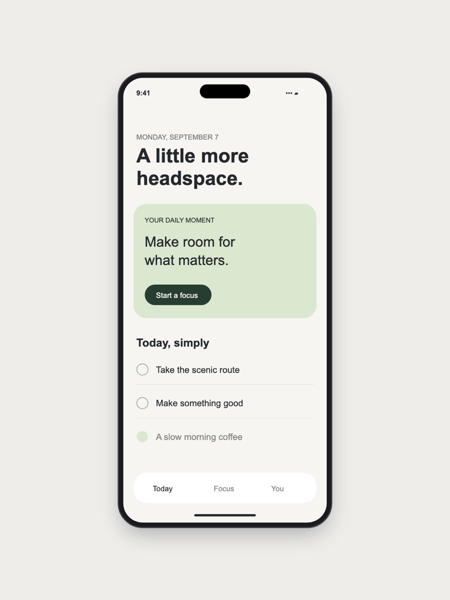
From a URL, in a few seconds
- Open the editor.
- Under Or capture a website, type the address, for example
example.com. - Tick Mobile and press Capture.
- The screenshot opens in an iPhone frame. Pick a background and export.
The capture loads the page the way an iPhone would: a 375 × 812 point screen (the size of an iPhone X) at 3× pixel density, with an iPhone browser identity, so sites serve their mobile layout. The image is 1125 × 2436 pixels.
The online capture shows the first screen of the page, not the whole scrolling length. It can’t see pages behind a login, local sites like localhost, or sites that block automated browsers. Use one of the methods below for those.
In Chrome or Edge, with device mode
Device mode works on any page you can open, including ones behind a login, and can capture the full scrolling height.
- Open DevTools with F12, or ⌘+⌥+I on a Mac.
- Press ⌘+⇧+M (Ctrl+Shift+M on Windows) to turn on the device toolbar.
- Choose a phone from the Dimensions menu, such as an iPhone, or type a width. Reload the page so the site serves its mobile version.
- Open the ⋮ menu at the right of the device toolbar and choose Capture screenshot for the visible screen or Capture full size screenshot for the whole page. The PNG goes to your Downloads folder.
The screenshot uses the device’s pixel ratio, so an iPhone preset gives a 3× image. If you typed a custom width, choose ⋮ → Add device pixel ratio and set DPR to 2 or 3 to avoid a blurry result.
In Firefox
- Press ⌘+⌥+M on a Mac or Ctrl+Shift+M on Windows to open Responsive Design Mode.
- Pick a device from the menu at the top and reload the page.
- Click the camera icon in the toolbar to save a screenshot of the phone-sized viewport.
In Safari
- Turn on developer features: Safari → Settings → Advanced, then tick Show features for web developers.
- Choose Develop → Enter Responsive Design Mode and pick an iPhone.
- Press ⌘+⇧+4 and drag over the phone preview to capture it.
On the phone itself
If you have the phone to hand, a real screenshot is the most accurate. On an iPhone press the side button and volume up together; on most Android phones press power and volume down. Send it to your computer with AirDrop, Quick Share or email, then drop it into the editor. The iPhone frame guide covers the rest.
Tips for a better mobile screenshot
- Dismiss cookie banners and app-install prompts before capturing. They cover a large part of a small screen.
- Check dark mode too. In Chrome DevTools, open the Rendering panel and set Emulate CSS media feature prefers-color-scheme to dark.
- Pick one part of the page. A mobile screen shows a lot less than a desktop one, so capture the section that matters rather than the top of the page by default.
- Use a 4:5 or 9:16 canvas for social posts so the phone fills the frame. See screenshot sizes.
Frequently asked questions
What screen size does the mobile capture use?
375 × 812 points at 3× density, the screen size of an iPhone X, which gives a 1125 × 2436 pixel image.
Can I capture the full length of a page in its mobile layout?
Yes, with Chrome or Edge device mode: choose Capture full size screenshot from the device toolbar’s ⋮ menu. The online capture only takes the first screen.
Why does the site still show its desktop layout?
Reload the page after turning on device mode; some sites only check the screen size when the page loads. If it still shows the desktop layout, the site may not have a mobile design.
Can I capture a page that needs me to log in?
Use device mode in your own browser, or the browser extension. The online capture runs on a server that isn’t logged in to your account.